 An energy pyramid is a graphical model of energy flow in a community. The different levels represent different groups of organisms that might compose a food chain. Have you ever wondered why there are limits to the lengths of food chains? An energy pyramid shape shows how the amount of useful energy that enters each level — chemical energy in the form of food — decreases as it is used up by the organisms in that level. How does this happen? Remember that most, if not all, organisms move. When they move around, breath, use their brains, notochords, heartbeats...all of this uses up energy in the body. When you run around, or become active haven't you felt warmer? That's your body burning energy or calories. Your brain is using up calories right now as you read this! Scientists have calculated that an average of 90% of the energy entering each step of the food chain is “lost” this way. The consumers at the top of a food pyramid, as a group, thus have much less energy available to support them than those closer to the bottom. That’s why their numbers are relatively few in most communities. Eventually, the amount of useful energy left can’t support another level. That’s why energy flow is depicted in the shape of a pyramid. The energy that enters a community is ultimately lost to the living world as heat. 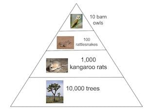 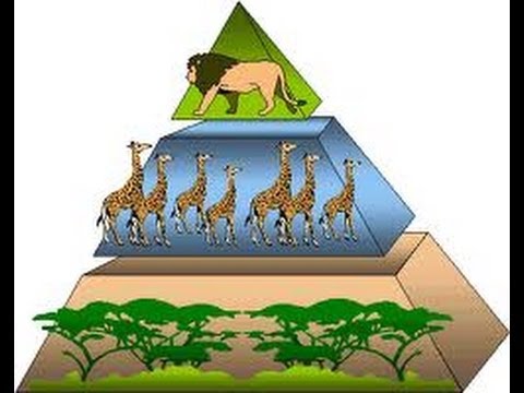 Does the ecological energy pyramid make a little more sense? The purpose of this model is to model the ten percent energy rule in a food chain. In food chains, the predator only gains about ten percent of the prey's energy. This pyramid effect leads to lower populations of upper-trophic-level predators.  Humans are said to be at the top of the food chain, but I wouldn't let this go to your head...  
10 Comments
|
Mrs. TaylorI love science! Everything about the world is interesting and never boring. I love to study plants, animals, insects, and people. My favorite subjects are my students who are the most unique organisms on the planet! Categories |
 RSS Feed
